How Do I Make My Landscapes?
A question that I’ve been asked many times is how do I create my sceneries? I find that the answers people are really looking for when they ask this question are where do I begin, and how do I keep the momentum going.Here’s my answer: a visual guide, that’s been segmented into what I believe are the four main stages of creating a basic landscape.As always, the goal of my work is to provide easy to use tools for artists of every level, that encourage creativity and inspiration.
What You’ll Need
For this project I recommend finding a reference picture, here’s the image I chose:
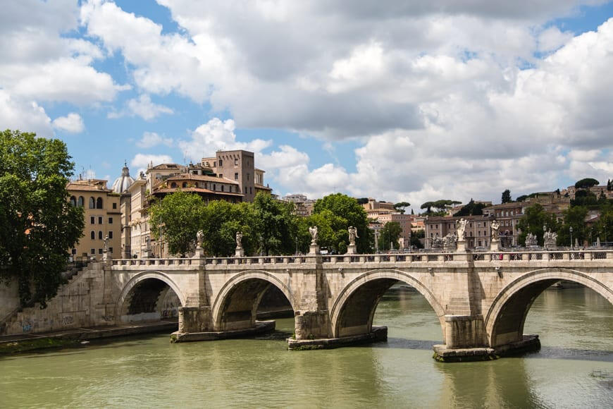
This is a photograph of the St. Angelo Bridge from Gaby’s Guide To Rome. When I’m choosing a reference photo, I like to see three things in the image:1. An interesting element of texture. In this example the stone bridge gives great subtle texture.
2. A form of movement. The flowing river is perfect for this.
3. Something of emphasis. It’s important to remember that your focal point doesn’t necessarily have to be a thing, a simple shadow can draw your audiences eyes to one spot.Of course, these are just the elements that I look for that work with my art style, but they’re generally contributors to a good composition. Depending on how you’re following along with this tutorial, you’ll also need a digital art program and compatible brushes, or a canvas, paint set, and paint brushes. Today I’ll be using Procreate and my Basic Brushset.
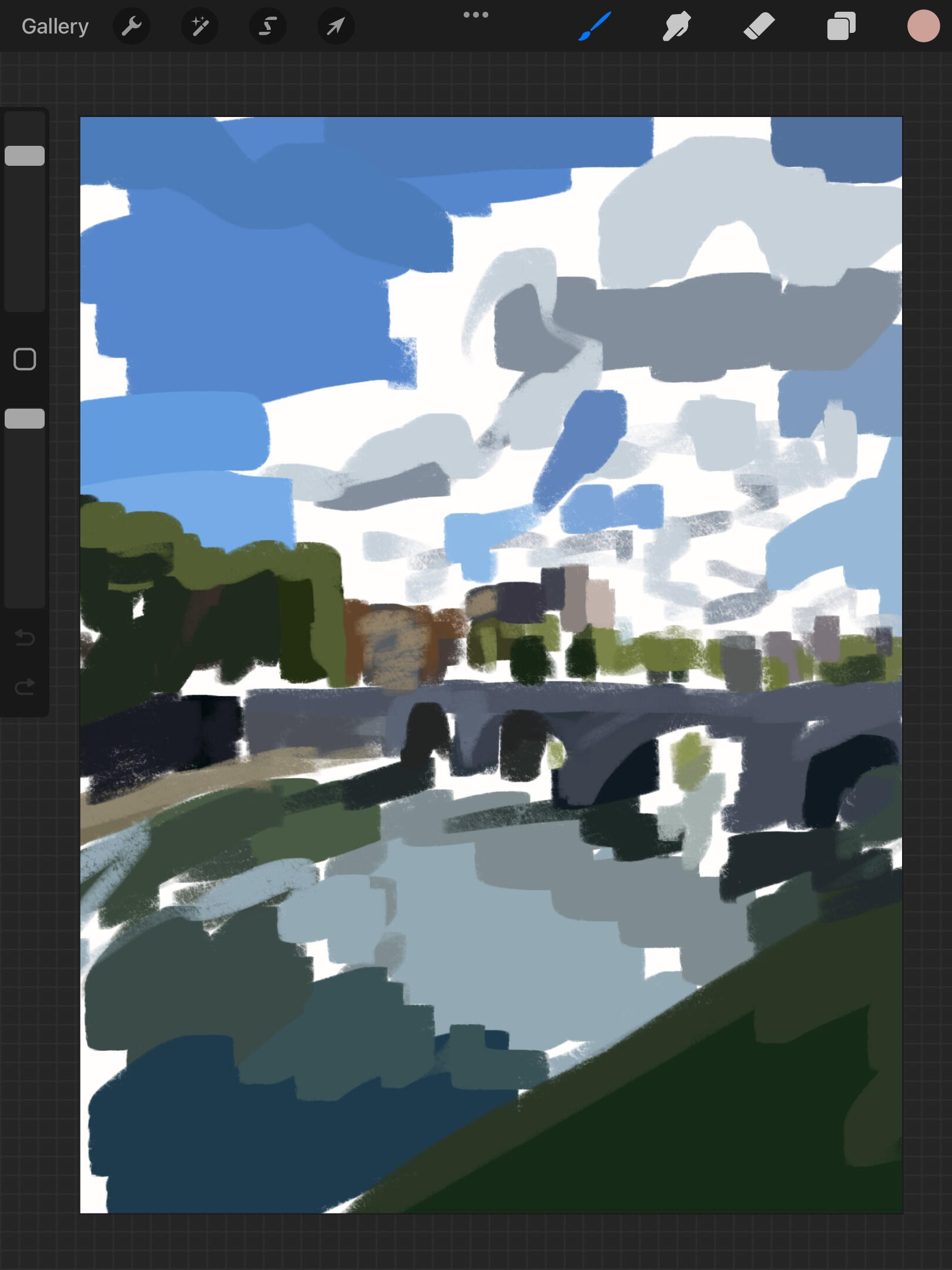
Step One
Starting a new piece can be overwhelming, but you’ve got to start somewhere. I throw down the base shapes and colors to map out my canvas, and start building from there. This is called the color blocking method. Essentially what we’re doing is blocking out the entire canvas by using blocks of color that get smaller as we refine and build detail. For the majority of this piece you should only need one digital brush, just keep decreasing it’s size during each step. It’s a good thing to keep checking your reference picture, but this is also the stage where you can make the biggest alterations to your layout, so take your creative liberty and really make this piece yours. This is typically when I feel the most motivated and inspired, so I try to get as much detail mapped out in one sitting as I can.
Step Two
Here’s where you really start to see your scenery come together, your main focal points should be taking shape and you’ll be adding some basic shadows and highlights to emphasize your goals for the piece. At this point I like to have color on my entire canvas, with light detailing so I can keep track of my plans for every section. If you look at my reference picture, and then at this stage of my scenery, you should be able to see the similarities, or at the very least be able to describe what you’re looking at. I have all my forms drawn out, and there’s enough definition to show what I’m making.
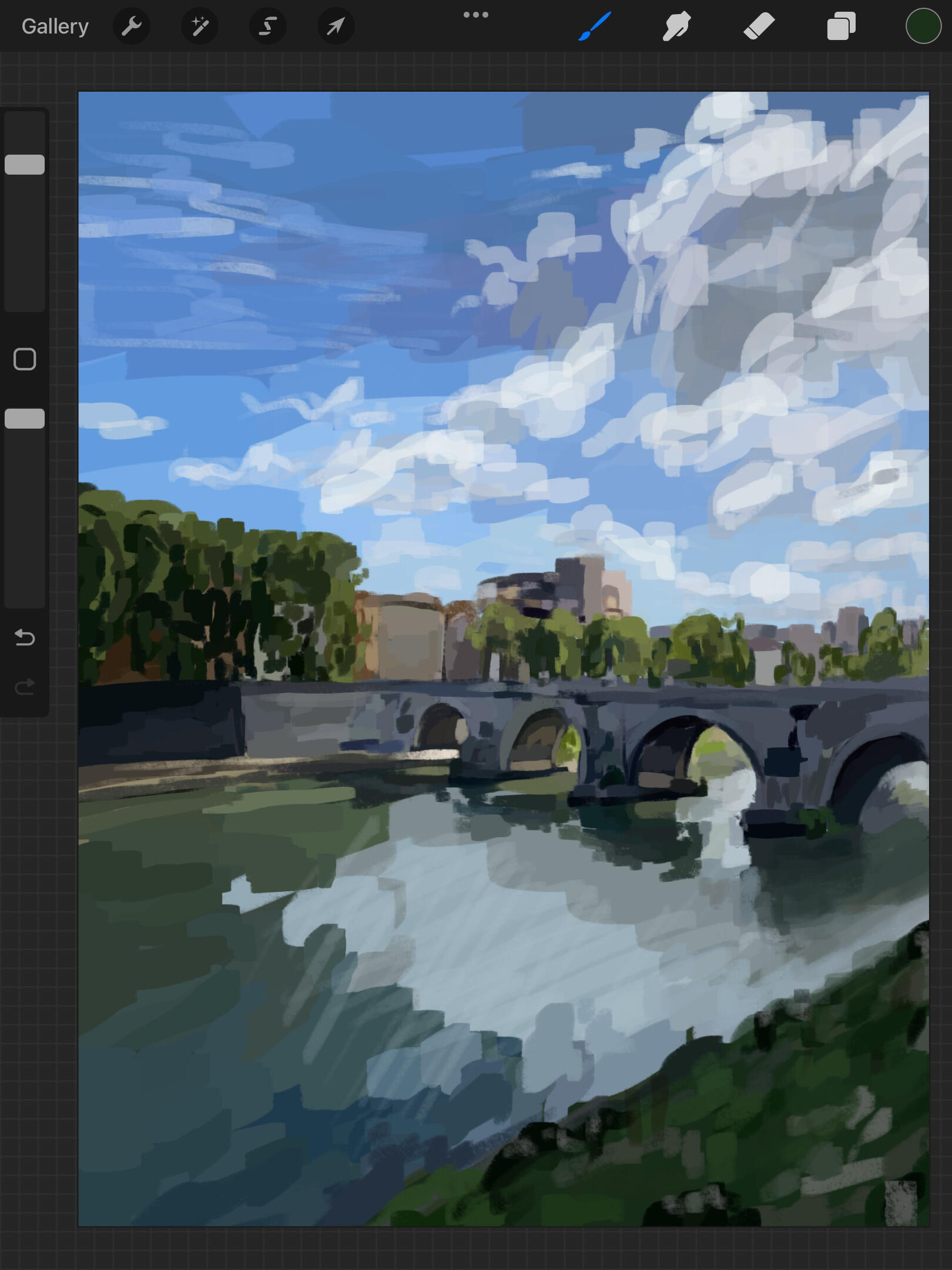
Step Three
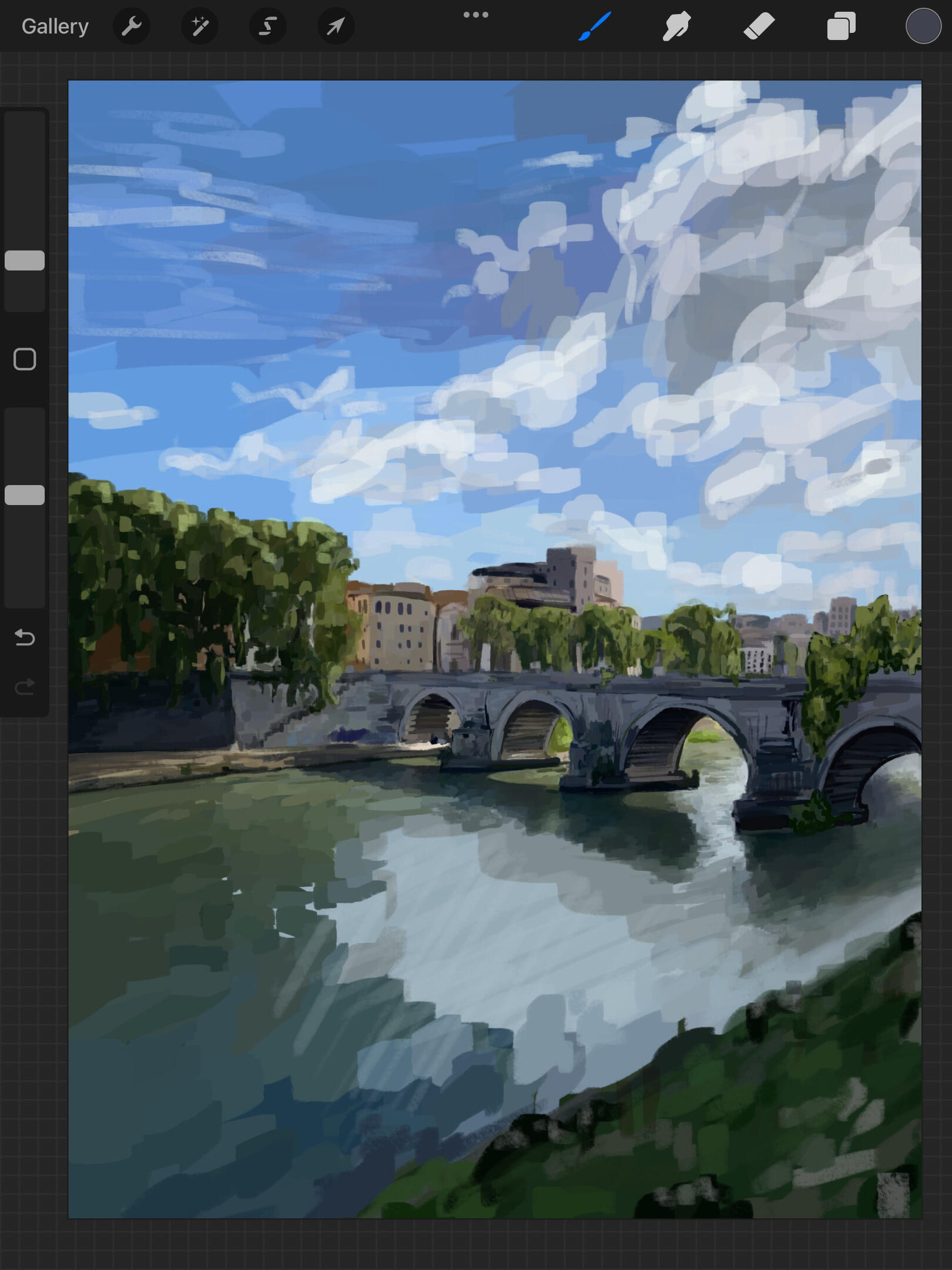
Now we just keep adding details. The more you add the easier it becomes to see what’s missing. This is also when I start making adjustments spatially. It’s helpful to take short breaks and occasionally flip your canvas, so you have the most clarity and objectiveness. I take a good long look at my work so far and really critique the perspective, proportions, and depth. Here you can see that I altered where the bridge and sidewalk meet, because it wasn’t accurate. This stage is also when I typically have to tell myself to grip my pen a little more loosely.
Step Four
Now that you’re almost done take a few moments to just examen your work. The more you look, the more tiny details you’ll find that you want to slightly adjust. I usually have to come back to a completed piece a few times before I’m officially ready to say it’s finished, so don’t rush yourself on this last step. Sometimes I can tell that something is missing, but I’m not quite sure what that is. More often than not what ends up being missing is color. Try adding pops of natural color like saturating a shadow or highlight. Using straight black and white can sometimes make a piece look flat. Or maybe you’re piece is too saturated, and what pulls everything together is toning it down. I also like to lower the transparency of my brush as I continue to add details, this is a great double ended tool because you can add more texture or blend harsher lines just by placement and opacity.
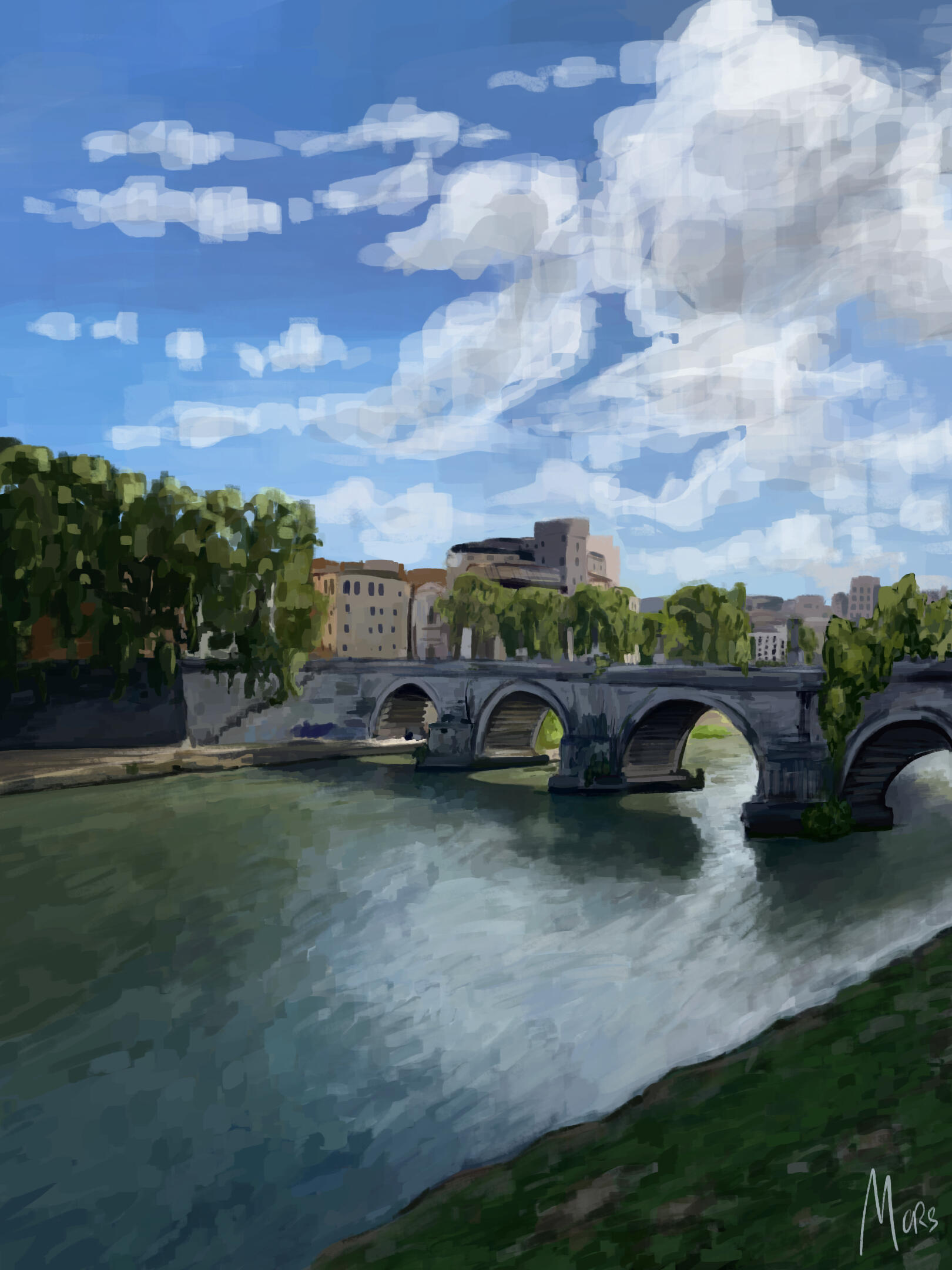
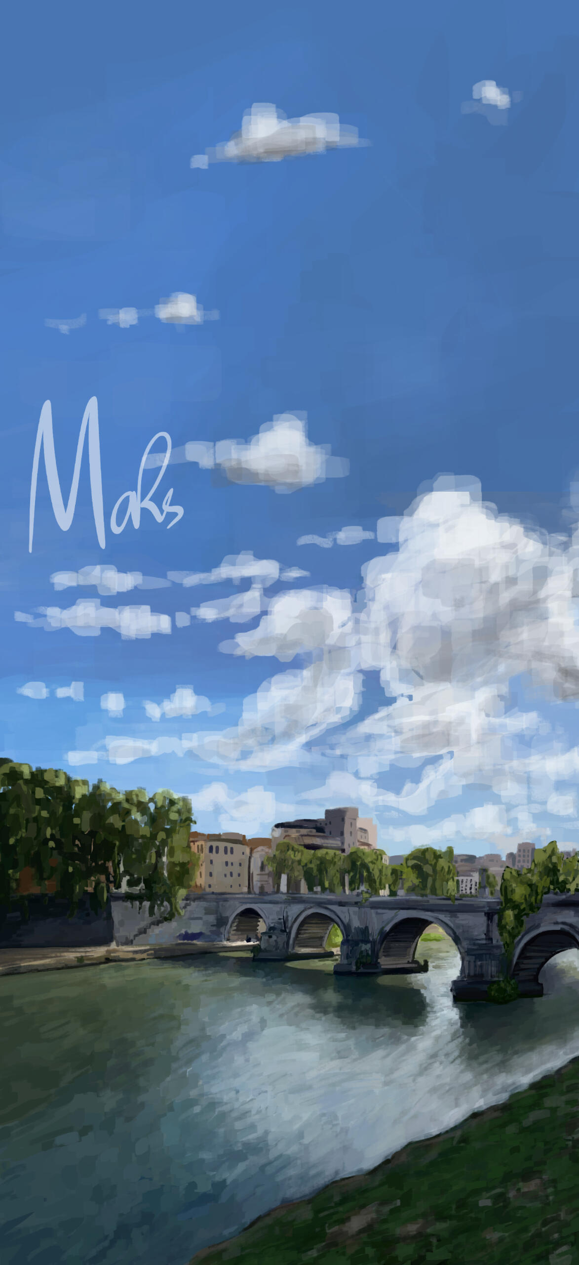
Finished Artwork
And here are my finished products, can you believe I created this entire piece with just one brush? I’ve also made an extended version that can be used as a phone wallpaper- feel free to download either for personal use. I hope you enjoyed creating this scenery with me!